- We are autodidacts
- What we present here works for us
- Read and follow the official Google Chart API documentation and Terms of Service
- Sometimes you have to re-load this presentation for the charts and all slides to appear
googleVis Tutorial
useR! Conference, Albacete, 9 July 2013
Markus Gesmann and Diego de Castillo
Authors of the googleVis package
Disclaimer
Agenda
- Introduction and motivation
- Google Chart Tools
- R package googleVis
- Concepts of googleVis
- Case studies
- googleVis on shiny
Introduction and motivation
Hans Rosling: No more boring data
Motivation for googleVis
Inspired by Hans Rosling’s talks we wanted to use interactive data visualisation tools to foster the dialogue between data analysts and others
We wanted moving bubbles charts as well
The software behind Hans’ talk was bought by Google and integrated as motion charts into their Visualisation API
Ideally we wanted to use R, a language we knew
Hence, we had to create an interface between the Google Chart Tools and R
Google Chart Tools
Introduction to Google Chart Tools
Google Chart Tools provide a way to visualize data on web sites
The API makes it easy to create interactive charts
It uses JavaScript and DataTable / JSON as input
Output is either HTML5/SVG or Flash
Browser with internet connection required to display chart
Please read the Google Terms of Service before you start
Structure of Google Charts
The chart code has five generic parts:
- References to Google’s AJAX and Visualisation API
- Data to visualize as a DataTable
- Instance call to create the chart
- Method call to draw the chart including options
- HTML <div> element to add the chart to the page
How hard can it be?
- Transform data into JSON object
- Wrap some HTML and JavaScript around it
- Thus, googleVis started life in August 2010
Motion chart example
suppressPackageStartupMessages(library(googleVis))
plot(gvisMotionChart(Fruits, "Fruit", "Year", options = list(width = 600, height = 400)))
R package googleVis
Overview of googleVis
googleVis is a package for R and provides an interface between R and the Google Chart Tools
The functions of the package allow users to visualize data with the Google Chart Tools without uploading their data to Google
The output of googleVis functions is html code that contains the data and references to JavaScript functions hosted by Google
To view the output a browser with an internet connection is required, the actual chart is rendered in the browser; some charts require Flash
See also: Using the Google Visualisation API with R, The R Journal, 3(2):40-44, December 2011 and googleVis package vignette
googleVis version 0.4.3 provides interfaces to
- Flash based
- Motion Charts
- Annotated Time Lines
- Geo Maps
- HMTL5/SVG based
- Maps, Geo Charts and Intensity Maps
- Tables, Gauges, Tree Maps
- Line-, Bar-, Column-, Area- and Combo Charts
- Scatter-, Bubble-, Candlestick-, Pie- and Org Charts
Run demo(googleVis) to see examples of all charts and read the vignette for more details.
Key ideas of googleVis
- Create wrapper functions in R which generate html files with references to Google's Chart Tools API
- Transform R data frames into JSON objects with RJSONIO
library(RJSONIO)
dat <- data.frame(x = LETTERS[1:2], y = 1:2)
cat(toJSON(dat))
## {
##  "x": [ "A", "B" ],
## "y": [ 1, 2 ]
## }
- Display the HTML output with the R HTTP help server
The googleVis concept
- Charts: 'gvis' + ChartType
- For a motion chart we have
M <- gvisMotionChart(data, idvar='id', timevar='date',
                     options=list(), chartid)
Output of googleVis is a list of list
Display the chart by simply plotting the output:
plot(M)Plot will generate a temporary html-file and open it in a new browser window
Specific parts can be extracted, e.g.
- the chart:
M$html$chartor - data:
M$html$chart["jsData"]
- the chart:
gvis-Chart structure
List structure:

Line chart with options set
df <- data.frame(label=c("US", "GB", "BR"), val1=c(1,3,4), val2=c(23,12,32))
Line <- gvisLineChart(df, xvar="label", yvar=c("val1","val2"),
        options=list(title="Hello World", legend="bottom",
                titleTextStyle="{color:'red', fontSize:18}",
                vAxis="{gridlines:{color:'red', count:3}}",
                hAxis="{title:'My Label', titleTextStyle:{color:'blue'}}",
                series="[{color:'green', targetAxisIndex: 0},
                         {color: 'blue',targetAxisIndex:1}]",
                vAxes="[{title:'Value 1 (%)', format:'##,######%'},
                                  {title:'Value 2 (\U00A3)'}]",
                curveType="function", width=500, height=300
                ))
Options in googleVis have to follow the Google Chart API options
Line chart with options
plot(Line)
On-line changes
You can enable the chart editor which allows users to change the chart.
plot(gvisLineChart(df, options = list(gvis.editor = "Edit me!", height = 350)))
Change motion chart settings
plot(gvisMotionChart(Fruits, "Fruit", "Year", options = list(width = 500, height = 350)))
Change displaying settings via the browser, then copy the state string from the 'Advanced' tab and set to state argument in options.
Ensure you have newlines at the beginning and end of the string.
Motion chart with initial settings changed
myStateSettings <- '\n{"iconType":"LINE", "dimensions":{
    "iconDimensions":["dim0"]},"xAxisOption":"_TIME",
    "orderedByX":false,"orderedByY":false,"yZoomedDataMax":100}\n'
plot(gvisMotionChart(Fruits, "Fruit", "Year",
      options=list(state=myStateSettings, height=320)))
Displaying geographical information
Plot countries' S&P credit rating sourced from Wikipedia (requires googleVis 0.4.3)
library(XML)
url <- "http://en.wikipedia.org/wiki/List_of_countries_by_credit_rating"
x <- readHTMLTable(readLines(url), which=3)
levels(x$Rating) <- substring(levels(x$Rating), 4,
                            nchar(levels(x$Rating)))
x$Ranking <- x$Rating
levels(x$Ranking) <- nlevels(x$Rating):1
x$Ranking <- as.character(x$Ranking)
x$Rating <- paste(x$Country, x$Rating, sep=": ")
G <- gvisGeoChart(x, "Country", "Ranking", hovervar="Rating",
                options=list(gvis.editor="S&P",
                             projection="kavrayskiy-vii",
                             colorAxis="{colors:['#91BFDB', '#FC8D59']}"))
Chart countries' S&P credit rating
plot(G)
Geo chart with markers
Display earth quake information of last 30 days
library(XML)
eq <- read.csv("http://earthquake.usgs.gov/earthquakes/feed/v0.1/summary/2.5_week.csv")
eq$loc=paste(eq$Latitude, eq$Longitude, sep=":")

G <- gvisGeoChart(eq, "loc", "Depth", "Magnitude",
                   options=list(displayMode="Markers",
                   colorAxis="{colors:['purple', 'red', 'orange', 'grey']}",
                   backgroundColor="lightblue"), chartid="EQ")
Geo chart of earth quakes
plot(G)
Org chart
Org <- gvisOrgChart(Regions, options=list(width=600, height=250,
                               size='large', allowCollapse=TRUE))
plot(Org)
Org chart data
Regions
##     Region  Parent Val Fac
## 1   Global    <NA>  10   2
## 2  America  Global   2   4
## 3   Europe  Global  99  11
## 4     Asia  Global  10   8
## 5   France  Europe  71   2
## 6   Sweden  Europe  89   3
## 7  Germany  Europe  58  10
## 8   Mexico America   2   9
## 9      USA America  38  11
## 10   China    Asia   5   1
## 11   Japan    Asia  48  11
Notice the data structure. Each row in the data table describes one node. Each node (except the root node) has one or more parent nodes.
Tree map
Same data structure as for org charts required.
Tree <- gvisTreeMap(Regions, idvar = "Region", parentvar = "Parent", sizevar = "Val",
    colorvar = "Fac", options = list(width = 450, height = 320))
plot(Tree)
Annotated time line data
Display time series data with notes.
head(Stock)
##         Date  Device  Value          Title          Annotation
## 1 2008-01-01 Pencils   3000           <NA>                <NA>
## 2 2008-01-02 Pencils  14045           <NA>                <NA>
## 3 2008-01-03 Pencils   5502           <NA>                <NA>
## 4 2008-01-04 Pencils  75284           <NA>                <NA>
## 5 2008-01-05 Pencils  41476 Bought pencils Bought 200k pencils
## 6 2008-01-06 Pencils 333222           <NA>                <NA>
Annotated time line
A1 <- gvisAnnotatedTimeLine(Stock, datevar = "Date", numvar = "Value", idvar = "Device",
    titlevar = "Title", annotationvar = "Annotation", options = list(displayAnnotations = TRUE,
        legendPosition = "newRow", width = 600, height = 300), chartid = "ATLC")
plot(A1)
Merging gvis-objects
G <- gvisGeoChart(Exports, "Country", "Profit",
                  options=list(width=250, height=120))
B <- gvisBarChart(Exports[,1:2], yvar="Profit", xvar="Country",
                  options=list(width=250, height=260, legend='none'))
M <- gvisMotionChart(Fruits, "Fruit", "Year",
                     options=list(width=400, height=380))
GBM <- gvisMerge(gvisMerge(G,B, horizontal=FALSE),
                 M, horizontal=TRUE, tableOptions="cellspacing=5")
Display merged gvis-objects
plot(GBM)
Embedding googleVis chart into your web page
Suppose you have an existing web page and would like to integrate the output of a googleVis function, such as gvisMotionChart.
In this case you only need the chart output from gvisMotionChart. So you can either copy and paste the output from the R console
print(M, "chart") #### or cat(M$html$chart)
into your existing html page, or write the content directly into a file
print(M, "chart", file = "myfilename")
and process it from there.
Embedding googleVis output via iframe
- Embedding googleVis charts is often easiest done via the iframe tag:
- Host the googleVis output on-line, e.g. public Dropbox folder
- Use the iframe tag on your page:
<iframe width=620 height=300 frameborder="0"
src="http://dl.dropbox.com/u/7586336/RSS2012/line.html">
Your browser does not support iframe
</iframe>
iFrame output
Including googleVis output in knitr with plot statement
With version 0.3.2 of googleVis
plot.gvisgained the argument'tag', which works similar to the argument of the same name inprint.gvis.By default the tag argument is
NULLandplot.gvishas the same behaviour as in the previous versions of googleVis.Change the tag to
'chart'andplot.gviswill produce the same output asprint.gvis.Thus, setting the
gvis.plot.tagvalue to'chart'inoptions()will return the HTML code of the chart when the file is parsed withknitr.See the example in
?plot.gvisfor more details
googleVis on shiny
Introduction to shiny
- R Package shiny from RStudio supplies:
- interactive web application / dynamic HTML-Pages with plain R
- GUI for own needs
- Website as server
What makes shiny special ?
- very simple: ready to use components (widgets)
- event-driven (reactive programming): input <-> output
- communication bidirectional with web sockets (HTTP)
- JavaScript with JQuery (HTML)
- CSS with bootstrap
Getting started: Setup
R> install.packages("shiny")from CRAN- Create directory
HelloShiny - Edit
global.r - Edit
ui.r - Edit
server.r R> shiny::runApp("HelloShiny")
Getting started: global.R
This file contains global variables, libraries etc. [optional]
## E.g.
library(googleVis)
library(Cairo)
The_Answer <- 42
Getting started: server.R
The Core Component with functionality for input and output as plots, tables and plain text.
shinyServer(function(input, output) {
       output$distPlot <- renderPlot({
         dist <- rnorm(input$obs)
         hist(dist)
         })
})
Getting started: ui.R
This file creates the structure of HTML
shinyUI(pageWithSidebar(
   headerPanel("Example Hello Shiny"),
   sidebarPanel(
      sliderInput("obs",  "", 0, 1000, 500)
   ),
   mainPanel(
      plotOutput("distPlot")
   )
))
Getting strated: runApp
R> shiny::runApp('HelloShiny')
Details for ui.r / part 1
Ready-to-Use widgets for input parameter:
- selectInput
- checkboxInput
- numericInput
- sliderInput
- textInput
- radioButtons
Details for ui.r / part 2
Elements for structural usage:
- conditionalPanel
- tabsetPanel + tabPanel
- includeMarkdown
Details for server.r
output components:
- renderPlot
- renderPrint
- renderGvis
- renderTable
additional compontents:
- downloadHandler
- fileInput
Example 1: Select data for a scatter chart
Example 1: server.R
# Contributed by Joe Cheng, February 2013 Requires googleVis version 0.4
# and shiny 0.4 or greater
library(googleVis)

shinyServer(function(input, output) {
    datasetInput <- reactive({
        switch(input$dataset, rock = rock, pressure = pressure, cars = cars)
    })
    output$view <- renderGvis({
        # instead of renderPlot
        gvisScatterChart(datasetInput(), options = list(width = 400, height = 400))
    })
})
Example 1: ui.R
shinyUI(pageWithSidebar(
  headerPanel("Example 1: scatter chart"),
  sidebarPanel(
    selectInput("dataset", "Choose a dataset:",
                choices = c("rock", "pressure", "cars"))
  ),
  mainPanel(
    htmlOutput("view") ## not plotOut!
  )
))
Example 2: Interactive table
Example 2: server.R
# Diego de Castillo, February 2013
library(datasets)
library(googleVis)
shinyServer(function(input, output) {
  myOptions <- reactive({
    list(
      page=ifelse(input$pageable==TRUE,'enable','disable'),
      pageSize=input$pagesize,
      height=400
    )
  })
  output$myTable <- renderGvis({
    gvisTable(Population[,1:5],options=myOptions())
  })
})
Example 2: ui.R
shinyUI(pageWithSidebar(
  headerPanel("Example 2: pageable table"),
  sidebarPanel(
    checkboxInput(inputId = "pageable", label = "Pageable"),
    conditionalPanel("input.pageable==true",
                     numericInput(inputId = "pagesize",
                                  label = "Countries per page",10))
  ),
  mainPanel(
    htmlOutput("myTable")
  )
))
Example 3: Animated geo chart
Example 3: global.R
## Markus Gesmann, February 2013
## Prepare data to be displayed
## Load presidential election data by state from 1932 - 2012
library(RCurl)
dat <- getURL("https://dl.dropboxusercontent.com/u/7586336/blogger/US%20Presidential%20Elections.csv",
              ssl.verifypeer=0L, followlocation=1L)
dat <- read.csv(text=dat)


## Add min and max values to the data
datminmax = data.frame(state=rep(c("Min", "Max"),21),
                       demVote=rep(c(0, 100),21),
                       year=sort(rep(seq(1932,2012,4),2)))
dat <- rbind(dat[,1:3], datminmax)
require(googleVis)
Example 3: server.R
shinyServer(function(input, output) {
  myYear <- reactive({
    input$Year
  })
  output$year <- renderText({
    paste("Democratic share of the presidential vote in", myYear())
  })
  output$gvis <- renderGvis({
    myData <- subset(dat, (year > (myYear()-1)) & (year < (myYear()+1)))
    gvisGeoChart(myData,
                 locationvar="state", colorvar="demVote",
                 options=list(region="US", displayMode="regions",
                              resolution="provinces",
                              width=400, height=380,
                              colorAxis="{colors:['#FFFFFF', '#0000FF']}"
                 ))
    })
})
Example 3: ui.R
shinyUI(pageWithSidebar(
  headerPanel("Example 3: animated geo chart"),
  sidebarPanel(
    sliderInput("Year", "Election year to be displayed:",
                min=1932, max=2012, value=2012,  step=4,
                format="###0",animate=TRUE)
  ),
  mainPanel(
    h3(textOutput("year")),
    htmlOutput("gvis")
  )
))
Example 4: googleVis with interaction
Example 4: server.R / part 1
require(googleVis)
shinyServer(function(input, output) {
  datasetInput <- reactive({
    switch(input$dataset, "pressure" = pressure, "cars" = cars)
  })
  output$view <- renderGvis({
    jscode <- "var sel = chart.getSelection();
    var row = sel[0].row;
    var text = data.getValue(row, 1);
    $('input#selected').val(text);
    $('input#selected').trigger('change');"
    gvisScatterChart(data.frame(datasetInput()),
                     options=list(gvis.listener.jscode=jscode,
                                  height=200, width=300))

  })
Example 4: server.R / part 2
  output$distPlot <- renderPlot({
    if (is.null(input$selected))
      return(NULL)

    dist <- rnorm(input$selected)
    hist(dist,main=input$selected)
  })

  output$selectedOut <- renderUI({
    textInput("selected", "", value="10")
  })
  outputOptions(output, "selectedOut", suspendWhenHidden=FALSE)
})
Example 4: ui.R
require(googleVis)
shinyUI(pageWithSidebar(
  headerPanel("", windowTitle="Example googleVis with interaction"),
  sidebarPanel(
    tags$head(tags$style(type='text/css', "#selected{ display: none; }")),
    selectInput("dataset", "Choose a dataset:",
                choices = c("pressure", "cars")),
    uiOutput("selectedOut")
  ),
  mainPanel(
    tabsetPanel(
      tabPanel("Main",
               htmlOutput("view"),
               plotOutput("distPlot", width="300px", height="200px")),
      tabPanel("About", includeMarkdown('README.md')
      ))))
)
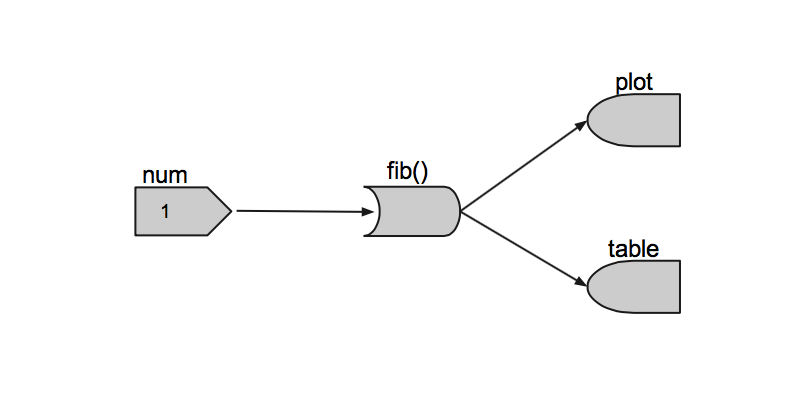
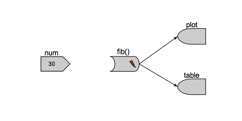
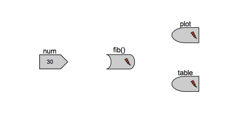
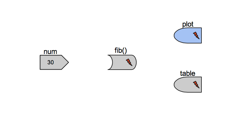
Reactive model
Three objects build the framework:
reactive source [selectInput]

reactive conductor [db-connect / calculate]

reactive endpoint [renderPlot/renderTable]

Reactive model
Reactive model
Reactive model
Reactive model
Reactive model
Reactive model
Reactive model
Reactive model
Reactive model
Reactive model
Reactive model
Further reading and examples
The End. Questions?
How we created these slides
library(slidify)
author("googleVis_Tutorial")
## Edit the file index.Rmd file and then
slidify("index.Rmd")
Blog articles with googleVis tips
Other R packages
- R animation package allows to create SWF, GIF and MPEG directly
- iplots: iPlots - interactive graphics for R
- Acinonyx aka iPlots eXtreme
- gridSVG: Export grid graphics as SVG
- plotGoogleMaps: Plot HTML output with Google Maps API and your own data
- RgoogleMaps: Overlays on Google map tiles in R
- rCharts
- clickme
Thanks
- Google, who make the visualisation API available
- All the guys behind www.gapminder.org and Hans Rosling for telling everyone that data is not boring
- Sebastian Perez Saaibi for his inspiring talk on 'Generator Tool for Google Motion Charts' at the R/RMETRICS conference 2010
- Henrik Bengtsson for providing the 'R.rsp: R Server Pages' package and his reviews and comments
- Duncan Temple Lang for providing the 'RJSONIO' package
- Deepayan Sarkar for showing us in the lattice package how to deal
with lists of options
- Paul Cleary for a bug report on the handling of months: Google date objects expect the months Jan.- Dec. as 0 - 11 and not 1 - 12.
- Ben Bolker for comments on plot.gvis and the usage of temporary
files
Thanks
- John Verzani for pointing out how to use the R http help server
- Cornelius Puschmann and Jeffrey Breen for highlighting a dependency issue with RJONSIO version 0.7-1
- Manoj Ananthapadmanabhan and Anand Ramalingam for providing ideas and code to animate a Google Geo Map
- Rahul Premraj for pointing out a rounding issue with Google Maps
- Mike Silberbauer for an example showing how to shade the areas in annotated time line charts
- Tony Breyal for providing instructions on changing the Flash security settings to display Flash charts locally
- Alexander Holcroft for reporting a bug in gvisMotionChart when displaying data with special characters in column names
- Pat Burns for pointing out typos in the vignette
Thanks
- Jason Pickering for providing a patch to allow for quarterly and weekly time dimensions to be displayed with gvisMotionChart
- Oliver Jay and Wai Tung Ho for reporting an issue with one-row data sets
- Erik Bülow for pointing out how to load the Google API via a secure connection
- Sebastian Kranz for comments to enhance the argument list for gvisMotionChart to make it more user friendly
- Sebastian Kranz and Wei Luo for providing ideas and code to improve the transformation of R data frames into JSON code
- Sebastian Kranz for reporting a bug in version 0.3.0
- Leonardo Trabuco for helping to clarify the usage of the argument state in the help file of gvisMotionChart
- Mark Melling for reporting an issue with jsDisplayChart and providing a solution
Thanks
- Joe Cheng for code contribution to make googleVis work with shiny
- John Maindonald for reporting that the WorldBank demo didn't download all data, but only the first 12000 records.
- Sebastian Campbell for reporting a typo in the Andrew and Stock data set and pointing out that the core charts, such as line charts accept also date variables for the x-axis.
- John Maindonald for providing a simplified version of the WorldBank demo using the WDI package.
- John Muschelli for suggesting to add 'hovervar' as an additional argument to gvisGeoChart.
- Ramnath Vaidyanathan for slidify.
Session Info
sessionInfo()
## R version 3.0.1 (2013-05-16)
## Platform: x86_64-apple-darwin10.8.0 (64-bit)
##
## locale:
## [1] de_DE.UTF-8/de_DE.UTF-8/de_DE.UTF-8/C/de_DE.UTF-8/de_DE.UTF-8
##
## attached base packages:
## [1] stats     graphics  grDevices utils     datasets  methods   base
##
## other attached packages:
## [1] XML_3.95-0.2    RJSONIO_1.0-3   googleVis_0.4.3 slidify_0.3.3
##
## loaded via a namespace (and not attached):
## [1] digest_0.6.3   evaluate_0.4.3 formatR_0.7    knitr_1.2
## [5] markdown_0.5.5 stringr_0.6.2  tools_3.0.1    whisker_0.3-2
## [9] yaml_2.1.7